Thursday, October 31, 2013

3 Project Portfolio

FIELD NOTES
A few things you probably ought to know.


Problem : ordinary people are lacking basic skills
Solution: picking a tagline that functions as a call out. 
visual style that is somewhat traditional and images created by hand - going back to the basics
Strengths: editorial design, illustration, information organization, etc.

"In our specialized society, the average citizen spends the majority of their time and energy learning to complete one task or focus on one field. In this assembly line system, many of us never learned basic techniques of life. We're facing huge global problems, so why not address things at the most basic level. Field Notes is a book series of simple how to's."

OFF THE LAND
We are what we eat.

Problem: Promoting health simply and without talking people's ears off; local food remains local
Solution: mobilize, take another form, and focus on resourcefulness, then health becomes a residual part of that; bold, stronger visual identity 
Strengths: Illustration, branding, expansion onto many media

"Local food has become a passion of many; individually, though, the concept has stayed quite isolated. Not any more. Off the Land began as a project tho take local farming to a global level while still maintaining a sense of integrity. 

In the process of traversing the U.S., we work with and befriend farmers, chefs and businesspeople alike. We rack up a rollodex of contacts, people of integrity who we then share with others we meet down the road. In doing so, we both benefit from and create a diverse network of people and make some mighty tasty food along the way.

We love fresh. We love simple. We love travel and people, and living Off the Land."

INFORMATION NOT INCLUDED ON MY RESUME
(need to think of new name)


Strengths: Information organization, iconography, poster design

This series of info graphics takes different aspects of my life and breaks them down into different elements. The style is geometric and technical, while the tone of the content is very human. I focus on conveying information in creative visual forms.

Q&A with VML

1) How do you and your agency aim to help address global problems through your work?

2) Do you have a range of roles or do you more so focus on one particular role/task set?

3) How collective is the creative process for projects?


4) Is there a hierarchy that can sometimes bog down creative communication or is it more open and free-flowing?

5) What is most fulfilling for you about participating in your career every day?

Wednesday, October 2, 2013

Project Redo - Off the Land - Food Truck Development

Creative Brief

Client An entrepreneur who is passionate about health and wants to spread it to the world. (Me, essentially).

Product/Idea Whole, healthy, simple, resourceful meals.

Purpose Convince people to actively engage in health, and that good health is pretty damn simple.

Competitors Both health-conscious companies and the vast array of food providers who don't give a damn about health, just efficiency.

Audience Adventurous folks who probably don't eat very healthfully but appreciate quality food.

Insights People don't like to be preached at. Yet everyone needs good health and functions better when they feel good.

Single Most Important Thing Everyone and anyone can make healthy tasty food with what they have + local food doesn't have to stay isolated.

Must haves Truck design, menu design, logo, website, app, ordering experience

Dos & Don’ts Don't talk people's ears off about nutrition

    • Don't come across as only for wealthy people
    • Don't be just another whole foods restaurant
    • Don't be preachy or instructive 
    • Don't try to include too many objectives
The Off the Land Story

Local food has become a passion of many; individually, though, the concept has stayed quite isolated. Not any more. 

Off the Land began as a project to take local farming to a global level while still maintaining a sense of integrity. With a vision for connecting small farms across the country, creating bonds within communities, and cooking simple, healthy meals, Off the Land hit the road in 2011. 

In the process of traversing the U.S., we work with and befriend farmers, chefs and businesspeople alike. We rack up a rollodex of contacts, people of integrity who we then share with others we meet down the road. In doing so, we both benefit from and create a diverse network of people and make some mighty tasty food along the way.

We love fresh. We love simple. We love travel and people, and living Off the Land.

Questions

Do I have too many objectives?
I can't determine if I'm trying to do too many things. It seems I have two main objectives to get across:

1) Connecting local farms on a national scale as well as to local people.
2) Nutrition and healthy life are pretty damn simple. 
3) Be resourceful and work with what you've got.

Is the name solid?
The name "Off the Land" comes from the concept of living off the land and working with the resources available, as well as the fact that it travels and isn't rooted in one spot. That's why the food truck travels from town to town and works directly with local farmers to use only local food that is in season. Does it stick?

Tuesday, September 17, 2013

The Future

Comfort the Children
Based in Austin, TX and Malaika, Kenya
ctcinternational.org

Zane Wilemon - Founder + Executive Director
Jeremiah Kuria - Kenya Director
Cali Huffman - Creative director

Comfort the Children International works alongside Kenyan communities to provide resources that create sustainable change. Instead of simply giving aid and money to those in need, we build relationships and programs that empower residents to help themselves.
CTC’s initiatives focus on education, environment, economy, health and community development that directly impact the community as a whole.

HIV/AID center
Medical care focusing on short and long-term needs of community
Community Gardens

This company presents an amazing opportunity to synthesize my knowledge and passion for health, community, and design. I actually plan to volunteer with them in Kenya this winter or summer and see what possibilities are open for the future.

Firebelly Design
Chicago, IL
Firebellydesign.com

Dawn Hancock - founder
Will Miller - Partner + Creative Director
Shannon Medic - Executive Director of Reason to Give (nonprofit)

"Good Design for Good Reason"

Divvy Public Bike System in Chicago
Chicago Women's Health Center

"We create positive world change connecting authentic companies with real people in socially responsible ways."
Firebelly is committed to cultivating connections between human beings and ideas, inspiring conscious thought and action. As early advocates for socially responsible design, we pioneered an ethic that values honesty, empathy and Good Design for Good Reason™.
They focus on community projects, on what is good for people, not just what will make money.

Chicago is one of my ideal places to live. My sister lives/works there now at Ogilvy & Mather. Brilliant to see a strictly design firm contributing to the community in tangible ways. I would love to work in their nonprofit and maybe continue their involvement in the community. 

GOOD
Based in Los Angeles, CA and New York, NY
good.is

(no list of employees, intentionally)

Pepsi Refresh Project
Vote.Give.Grow with Starbucks

GOOD is the leading media and community platform enabling people who give a damn to come together and move the world forward
GOOD creates media, community-based, and digital products that help make the world better place.
GOOD is a global community of, by, and for pragmatic idealists working towards individual and collective progress.
Their website, print magazine, collaborative website, etc. all contribute towards
educating the general public about real issues and providing a platform for
collaboration and connection.


They are known for their info graphics, and I would love to help them create these. I have always been very passionate about info graphics and any effort to convey ACTUAL INFORMATION beyond just entertainment to the general public. 

Thursday, August 29, 2013

Field Notes Expansion

Field Notes will be my expansion.

CONCEPT

Field Notes from the Kitchen is the first in a series of books designed to educate people about things we all probably ought to know. In our specialized society, the average citizen spends the majority of their time and energy learning to complete one task or focus on one field. In this assembly line system, many of us never learned simple techniques of basic life, like how to fix a flat or can food.

These books will teach people such basic techniques. Each book will focus on a different topic. Posters also serve as reminders and decor.

WHY EXPAND

I've begun the book development with "Field Notes from the Kitchen," but there is so much more out there that people should know. This project is a natural expansion, as each book opens up a new topic of learning. I want to focus my design work here on out on addressing basic human needs, and everyone can learn from this. 

CHANNELS OF EXPANSION

I would like to design a cohesive book series including at least three books, as well as create notecard sized graphics with condensed explanations of each technique for quick referencing. Exploring environmentally conscious printing choices is also important to me. I intent to potentially publish these eventually.


Tuesday, November 15, 2011

Fotografias


David Hilliard's photos tell a story using a succession of photographs (triptych) taken of the same scene and placed together. His subjects are usually his personal friends and loved ones, and he focuses on daily life.


Ellen von Unwerth uses women as her subjects and creates gritty, sexualized photographs. Her work has been described as erotic femininity. She worked as a fashion model for ten years before creating fashion and editorial work from the other side of the camera. She's worked with numerous musical artists in their promotional stuff, and she also does short films.


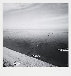
Harry Callahan, doing most of his work in the mid 20th century, has a very minimalistic style.  His technique was simple : go out everyday to the places he always goes and take lots of pictures. His photographs isolated the subject so as to focus on the intricacies of that form itself. His wife was the subject of his photos quite often.


Horst P. Horst was a German fashion photographer. His meeting of dancer Evan Weidemann aroused his interest in avante-garde art. He began photographing for Vogue in 1931, and also met Coco Chanel whom he called "the queen of the whole thing" and photographer her art for three decades. After applying for citizenship, he became a part of the army and photographed the army. He focused on careful lighting and surreal setups. 


Irving Penn is also known for his portraiture and fashion photography. Irving Penn studied under Alexy Brodovitch at the Philadelphia Museum School of Industrial Art (now the University of the Arts) from which he was graduated in 1938. Penn's drawings were published by Harper's Bazaar and he also painted. As his career in photography blossomed, he became known for post World War II feminine chic and glamour photography.

He photographed still life objects and found objects in unusual arrangements with great detail and clarity. His subjects varied widely, but his prints are always clean and krispy. His work was often not appreciated until after its time.

"Sensitive people faced with the prospect of a camera portrait put on a face they think is one they would like to show the world... Very often what lies behind the facade is rare and more wonderful than the subject knows or dares to believe." – Irving Penn


William Eggleston has a unique ability to find beauty, and striking displays of color, in ordinary scenes. A dog trotting toward the camera; a Moose lodge; a woman standing by a rural road; a row of country mailboxes; a convenience store; the lobby of a Krystal fast-food restaurant—all of these ordinary scenes take on new significancein the rich colors of Eggleston's photographs. Eudora Welty suggests that Eggleston sees the complexity and beauty of the mundane world: "The extraordinary, compelling, honest, beautiful and unsparing photographs all have to do with the quality of our lives in the ongoing world: they succeed in showing us the grain of the present, like the cross-section of a tree.... They focus on the mundane world. But no subject is fuller of implications than the mundane world!" Mark Holborn, in his introduction to Ancient and Modern writes about the dark undercurrent of these mundane scenes as viewed through Eggleston's lens: "[Eggleston's] subjects are, on the surface, the ordinary inhabitants and environs of suburban Memphis and Mississippi--friends, family, barbecues, back yards, a tricycle and the clutter of the mundane. The normality of these subjects is deceptive, for behind the images there is a sense of lurking danger." American artist Edward Ruscha said of Eggleston's work, "When you see a picture he’s taken, you’re stepping into some kind of jagged world that seems like Eggleston World.”


Friday, November 11, 2011

Letter Fountain

Smaller versions of capital letters that are specially designed are called small capitals. They have identical weight and hit slightly above the x-height of lowercase letters. Small capitals are used as a balance between the boldness of full caps and minimize visual overcrowding. Memphis has no small capitals

Ligatures are specially designed combinations of characters that traditionally have the problem of crashing into each other. For example, fi and fl because the ascender of the letter "f" would crash into the ascender or the dot of an "i" if it indirectly follows the "f". Extra space is added for increased legibility, and it must be set separately. There are no ligatures in Memphis.

The foot mark is used to show the measurement of feet and is represented as an angled line. Sometimes mistaken as an apostrophe, the foot mark lacks the rounded ball and general nine-like shape of an apostrophe. Smart quotes allow for correcting the mistake of using a foot mark instead of an apostrophe.


Hyphens are used as a symbol to break up words. En dashes, on the other hand, are longer than hyphens and indicate a sudden change of thought, working much like a comma and also to show a range in value (i.e. years).