Weight is the density or heaviness of individual characters relative to surrounding letterforms.
The horizontal length of a character, from one end to the other, is called the width.
In design, style refers to the manner or mode of expression, execution, construction, or design.
A typeface refers to a set of characters, generally a comlete set of the alphabet with numbers and a few other assorted characters, with a consistent style. When they are available in different sizes and points, they are referred to as a font.
The x-height of a letter is accurately named and refers to the basic height of a typeface.
Some letters have vertical extensions. The height of these is called the cap height.
More soon fa sho.
Tuesday, August 30, 2011
Wednesday, August 24, 2011
Shadowboxing
Alifish and I set off on a quest for typography.

The result was a straightener and a janky (almost) dorm room photo studio. It turned out very differently than my initial shadow idea, but I like that. Ali's suggestion of using a straightener added interesting shapes and a nice juxtaposition of rigid lines with the more organic nature of the cord. Turned out way more abstract.
I (Heart) Carabiners

Who doesn't, really.
Mainly used to do this,

What I love most about carabiners is their simplicity. Each part of a biner is vital; take away one single element, and it will cease to function. This simplicity is something I'm striving to cultivate in my own design. Throughout my design career, my work has consistently been decorative and elaborate. I truly admire design that is first and foremost functional.
Got my carabiner keychain for inspiration. Just got to keep on truckin'.
Define define define
A grid is an infrastructure upon which to build both complex and austere layouts that enable hierarchy and accessibility through flexibility and consistency.

Grids are heavily accredited to Swiss Design, which emphasizes visual simplicity and uniformity through the deployment of design elements on a mathematically constructed grid, allowing for precise, clean layouts. This is why graphic designers use them.

A modular grid has consistent horizontal divisions from top to bottom in addition to vertical divisions from left to right.
Margins are the spaces separating the content in the middle from the edge of the paper.
The vertically aligned groupings of modules are called columns.
A grid module is each individual box in the module.
The continuous lines that align each module are called flowlines.
The gutter is the space between modules.
Just as typography evokes certain meanings based on typeface, typographic color evokes those same ideas bases on associations with color and different hues.
Hierarchy involves emphasizing, prioritizing and emphasizing certain elements of a graphic more heavily than others. Portrayed clearly, consciously implemented visual prompts direct a viewer's attention appropriately based on the importance of each individual element or piece of information.
White space, often misunderstood, can be an effective tool in establishing proper spacing to create a hierarchy. It can offer a visual "break" or even create suspense. Contrast, both within the layout and of the layout to its context, forces distinction between specific elements and allows important parts to stand apart.
(Answers paraphrased and quoted from Graphic Design Referenced by Bryony Gomez-Palacio and Armin Vit)
Back to business
Welp, back to Lawrence and getting right back into the swing of things. It's wonderful starting a new class and not being completely lost. I've learned so much this past year; still have a crazy huge amount to learn ahead of me. Can't wait :)


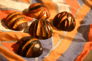


Here are a few things I worked on in the summa time in the midst of waiting tables.
These first few are avocado seeds. First batch carved without stabbing myself!


You can probably see why I didn't pick a bird for my animal project. Call me crazy, but they may be a smidge overdone in my sketchbook.
Subscribe to:
Posts (Atom)