Tuesday, November 15, 2011

Fotografias


David Hilliard's photos tell a story using a succession of photographs (triptych) taken of the same scene and placed together. His subjects are usually his personal friends and loved ones, and he focuses on daily life.


Ellen von Unwerth uses women as her subjects and creates gritty, sexualized photographs. Her work has been described as erotic femininity. She worked as a fashion model for ten years before creating fashion and editorial work from the other side of the camera. She's worked with numerous musical artists in their promotional stuff, and she also does short films.


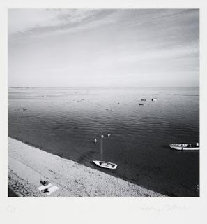
Harry Callahan, doing most of his work in the mid 20th century, has a very minimalistic style.  His technique was simple : go out everyday to the places he always goes and take lots of pictures. His photographs isolated the subject so as to focus on the intricacies of that form itself. His wife was the subject of his photos quite often.


Horst P. Horst was a German fashion photographer. His meeting of dancer Evan Weidemann aroused his interest in avante-garde art. He began photographing for Vogue in 1931, and also met Coco Chanel whom he called "the queen of the whole thing" and photographer her art for three decades. After applying for citizenship, he became a part of the army and photographed the army. He focused on careful lighting and surreal setups. 


Irving Penn is also known for his portraiture and fashion photography. Irving Penn studied under Alexy Brodovitch at the Philadelphia Museum School of Industrial Art (now the University of the Arts) from which he was graduated in 1938. Penn's drawings were published by Harper's Bazaar and he also painted. As his career in photography blossomed, he became known for post World War II feminine chic and glamour photography.

He photographed still life objects and found objects in unusual arrangements with great detail and clarity. His subjects varied widely, but his prints are always clean and krispy. His work was often not appreciated until after its time.

"Sensitive people faced with the prospect of a camera portrait put on a face they think is one they would like to show the world... Very often what lies behind the facade is rare and more wonderful than the subject knows or dares to believe." – Irving Penn


William Eggleston has a unique ability to find beauty, and striking displays of color, in ordinary scenes. A dog trotting toward the camera; a Moose lodge; a woman standing by a rural road; a row of country mailboxes; a convenience store; the lobby of a Krystal fast-food restaurant—all of these ordinary scenes take on new significancein the rich colors of Eggleston's photographs. Eudora Welty suggests that Eggleston sees the complexity and beauty of the mundane world: "The extraordinary, compelling, honest, beautiful and unsparing photographs all have to do with the quality of our lives in the ongoing world: they succeed in showing us the grain of the present, like the cross-section of a tree.... They focus on the mundane world. But no subject is fuller of implications than the mundane world!" Mark Holborn, in his introduction to Ancient and Modern writes about the dark undercurrent of these mundane scenes as viewed through Eggleston's lens: "[Eggleston's] subjects are, on the surface, the ordinary inhabitants and environs of suburban Memphis and Mississippi--friends, family, barbecues, back yards, a tricycle and the clutter of the mundane. The normality of these subjects is deceptive, for behind the images there is a sense of lurking danger." American artist Edward Ruscha said of Eggleston's work, "When you see a picture he’s taken, you’re stepping into some kind of jagged world that seems like Eggleston World.”




Friday, November 11, 2011

Letter Fountain

Smaller versions of capital letters that are specially designed are called small capitals. They have identical weight and hit slightly above the x-height of lowercase letters. Small capitals are used as a balance between the boldness of full caps and minimize visual overcrowding. Memphis has no small capitals

Ligatures are specially designed combinations of characters that traditionally have the problem of crashing into each other. For example, fi and fl because the ascender of the letter "f" would crash into the ascender or the dot of an "i" if it indirectly follows the "f". Extra space is added for increased legibility, and it must be set separately. There are no ligatures in Memphis.

The foot mark is used to show the measurement of feet and is represented as an angled line. Sometimes mistaken as an apostrophe, the foot mark lacks the rounded ball and general nine-like shape of an apostrophe. Smart quotes allow for correcting the mistake of using a foot mark instead of an apostrophe.


Hyphens are used as a symbol to break up words. En dashes, on the other hand, are longer than hyphens and indicate a sudden change of thought, working much like a comma and also to show a range in value (i.e. years). 

Tuesday, October 18, 2011

Typeface Classifications

Breaking down the different types of letterforms.


Old Style
• The axis of thick/thin slopes slightly left
• Greater contrast between thick and thin
• Cross bar of the "e" is horizontal
• Top serifs are roof-shaped and triangular
• Base serifs have hardly any or no rounding


As evidenced in Bembo, Plantin, Garamond Sabon, Albertina


Transitional
• Axis of transition is vertical or slopes slightly left
• Base serif is slightly rounded
• Lowercase "e" crossbar is horizontal
• Top serifs of lowercase letters are roof-shaped
• ROunded, sharpened, or horizontal serifs


Qualities shown in Baskerville, Concorde, Fournier, Perpetua, Caslon, Old Face, Times New Roman


Modern
Emphasis on vertical stroke and sharp contrasts
• Symmetry and sharp transition to straight
• Axis is vertical
• Easy adjustments to thickness and width allow for many variants


Examples are Filla Sophia, Bodoni, Didot, Walbaum, Linotype, Centennial


Slab
• Little contrast between thick and thin
• Heavy rectangular serifs – thick as the letters themselves
• SUbdivided by lowercase letters
• Appear to be sans serif with serifs added


Can be seen in Memphis, Antique, First Clarendon, Beton, PMN Caecilia, Serifa


Grotesk
• Angular letterforms
• Calligraphic shape and movement
• Very distinct in appearance
• Old fashioned looking, formal


Grotesk typefaces include Cloister Clack, Alte Schwabacher, San Marco, Luthersche Fraktur, Fette Fraktur


Geometric
• No serifs
• Thickness only minimally and visually connected
• Vertical axis
• Very precise lettering


As seen in Futura, Avant Garde, Eurostile, Erbar, Neuzeit Grotesk

Sunday, September 25, 2011

Unique Ambiance

Doing some brainstorming of unique restaurant experiences. 


Check the other nine out at 10 Unusual and Creative Restaurants

Sunday, September 11, 2011

A little psychedelic inspiration

Devendra, channelling Buddhism and simplicity of a seahorse. Good stuff man.


Saturday, September 10, 2011

Munchies

For our second excursion to find words in their natural habitat, Brenna and I decided to portray the herbal influence that generates a distinct need for tacos.


Our dried leaf weed looks pretty legit eh?

Tuesday, September 6, 2011

Design history what what

Dead and gone


Max Miedinger is most famous for creating the typeface Helvetica (Which I'm using right now! Fun stuff.)  A swiss designer, he created a typeface that became the poster child for cutting edge Swiss design.


Robert Koch  developed the typeface Wilhelm Klingspor Gotisch in Frankfurt after being inspired by fourteenth century manuscripts.


Claude Garamond was inspired by the roman cut by Francesco Griffito when he developed Hypnerotomachia Polophilius.


Ludovico Degli designed an initially italic Blado typeface which was later revived by Stanley Morison in 1923. These italics, called Arrighi italics, are seen as the first cursive typefaces in print.


Bram de Does's work can be seen on the pages of a Dutch dictionary. His typeface Lexicon no. 1 is a vertically compact form, maximizing legibility in tightly packed text.


In the land of the living


Hailing from South Africa, Margaret Calvert  did much of her work after she moved to England. She designed many of the road signs used throughout Great Britain in addition to creating the typeface Transport for the British Rail System. 


Hermann Zapf designed Optima in 1958, a piece in the Liontype collection which remains one of the top five highest selling typefaces in Linotype.


Tim Ahrens designed Linotype Aroma in 1999. The family now includes other variations, such as ExtraLight, Light and SemiBold.


Andreu Balius was inspired by old Catalan typefaces while designing Pradell and Trochut. For Pradell, Balius attempted to capture the style evoked by Audald Pradell's work.


Jonathan Barnbrook, an Englishman, began designing typefaces because of his belief that designers had significant influence on the image and the layout of design but had not power over the typeface. He published the typefaces Exocet and Mason with a questioning mind, drawing influence from a likeminded thinker, Eric Gill, whose social awareness led him to dare defy 'unquestionable' things.

The typeface of the Univers

"I first experienced the power of type to make the whole intellectual world readable with the same letters in the days of metal." Adrian Frutiger, born to a weaver in Unterseen, Switzerland, changed the face of type with his unique perpective. Never quite accepting what he was told, he constantly experimented with new ways of looking at the world, namely type faces. He began his work young as an apprentice for a printer at sixteen, but soon found his niche in calligraphy.


His love of sculpture, though discouraged by teachers and his father, continued to influence his type forms. 


His persistance in creativity and confidence in his own talent laid the foundation for brilliance, and a new type face. "When we came to the 'Grotesk' style of sans-serif, however, I had my own ideas which led to the Univers family."


Univers was appreciated instantly. Rejecting the regimented form of Futura, Frutiger drew inspiration from the neo-grotesque model. With the new typeface also came a new classification system to indicate weight, width and style. 

Tuesday, August 30, 2011

Def def def def

Weight is the density or heaviness of individual characters relative to surrounding letterforms.
The horizontal length of a character, from one end to the other, is called the width
In design, style refers to the manner or mode of expression, execution, construction, or design. 
A typeface refers to a set of characters, generally a comlete set of the alphabet with numbers and a few other assorted characters, with a consistent style. When they are available in different sizes and points, they are referred to as a font.
The x-height  of a letter is accurately named and refers to the basic height of a typeface.
Some letters have vertical extensions. The height of these is called the cap height


More soon fa sho.

Wednesday, August 24, 2011

Shadowboxing

Alifish and I set off on a quest for typography. 


The result was a straightener and a janky (almost) dorm room photo studio. It turned out very differently than my initial shadow idea, but I like that. Ali's suggestion of using a straightener added interesting shapes and a nice juxtaposition of rigid lines with the more organic nature of the cord. Turned out way more abstract.

I (Heart) Carabiners


Who doesn't, really. 


Mainly used to do this,


carabiners consist of a metal loop, a gate and a screw lock. They were invented by German Otto Herzog in 1910.


What I love most about carabiners is their simplicity. Each part of a biner is vital; take away one single element, and it will cease to function. This simplicity is something I'm striving to cultivate in my own design. Throughout my design career, my work has consistently been decorative and elaborate. I truly admire design that is first and foremost functional.


Got my carabiner keychain for inspiration. Just got to keep on truckin'.

Define define define

A grid is an infrastructure upon which to build both complex and austere layouts that enable hierarchy and accessibility through flexibility and consistency.

Grids are heavily accredited to Swiss Design, which emphasizes visual simplicity and uniformity through the deployment of design elements on a mathematically constructed grid, allowing for precise, clean layouts. This is why graphic designers use them.


modular grid has consistent horizontal divisions from top to bottom in addition to vertical divisions from left to right.

Margins are the spaces separating the content in the middle from the edge of the paper.
The vertically aligned groupings of modules are called columns.
A grid module is each individual box in the module.
The continuous lines that align each module are called flowlines.
The gutter is the space between modules.

Just as typography evokes certain meanings based on typeface, typographic color evokes those same ideas bases on associations with color and different hues.

Hierarchy involves emphasizing, prioritizing and emphasizing certain elements of a graphic more heavily than others. Portrayed clearly, consciously implemented visual prompts direct a viewer's attention appropriately based on the importance of each individual element or piece of information.

White space, often misunderstood, can be an effective tool in establishing proper spacing to  create a hierarchy. It can offer a visual "break" or even create suspense. Contrast, both within the layout and of the layout to its context, forces distinction between specific elements and allows important parts to stand apart.

(Answers paraphrased and quoted from Graphic Design Referenced by Bryony Gomez-Palacio and Armin Vit)

Back to business

Welp, back to Lawrence and getting right back into the swing of things. It's wonderful starting a new class and not being completely lost. I've learned so much this past year; still have a crazy huge amount to learn ahead of me. Can't wait :)


Here are a few things I worked on in the summa time in the midst of waiting tables.

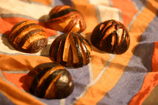
These first few are avocado seeds. First batch carved without stabbing myself!


You can probably see why I didn't pick a bird for my animal project. Call me crazy, but they may be a smidge overdone in my sketchbook.


Monday, April 25, 2011

More book lovelies


Lots of pieces are always engaging. Like a little kit.


Brilliant illustration.


Love this binding! Very substantial and intentional.


Creating dimension with layers of paper. Definitely would be cool to do if I stick to paper.

Building layers using transparent sheets. Done often, but could be very cool.

Simple, but very clean lines.


More beautiful layering.


Crazy awesome book creations

Thought I would browse the ol' Net to get some book ideas that go beyond the pages. Some do, and some are just really frickin cool.


I love the detailing, as well as the color and line quality.


Yeah, pretty obvious representation a fruit, but I do appreciate the layers.


Love the integration of different media and the color scheme. Beautiful contrast that still maintains cohesion – something that I'm really working on cultivating in my own work.


The step by step format could work wonderfully for my experience. Just need to do it in a fresh way.


Who can resist beautiful, tiny, detailed shit?! Certainly not me.


I really appreciate the binding on this book. It's also upcycled, which is pretty darn awesome.


This is handmade. The natural quality of the paper edges is beautiful and could really compliment the natural components of my avocado.

Oh the possibilites....